Pedalio
As part of the course “IN2000 - Software Engineering med prosjektarbeid”, I collaborated with a group of five students to build the android application Pedalio. A navigation app for cyclists that highlights bike paths and visualizes air pollution. We utilized the TomTom API for map information and the Meteorological Institute's API for weather data. Our focus was on tailoring the app for frequent cyclists, particularly those who are colorblind or have respiratory issues. We wanted to have Universal Design as a core principle throughout our work. We adopted Scrum as our agile methodology, holding regular meetings and maintaining a scrum board to track our progress. The project resulted in both the application and a comprehensive 115-page report documenting our project. The programming language used was Kotlin.


Initial data gathering
We held numerous group and individual semi structured interviews in order to map out the needs of the participants. Later on we gathered them in an affinity diagram in Miro and looked for patterns in the data that revealed needs they had in common.

user stories and use case diagrams
After the initial data nalysis we wrote out a number of text based user stories in order to better highlight the needs of the participants.We also utilized use case diagrams in order to further our understand of the needs of the users
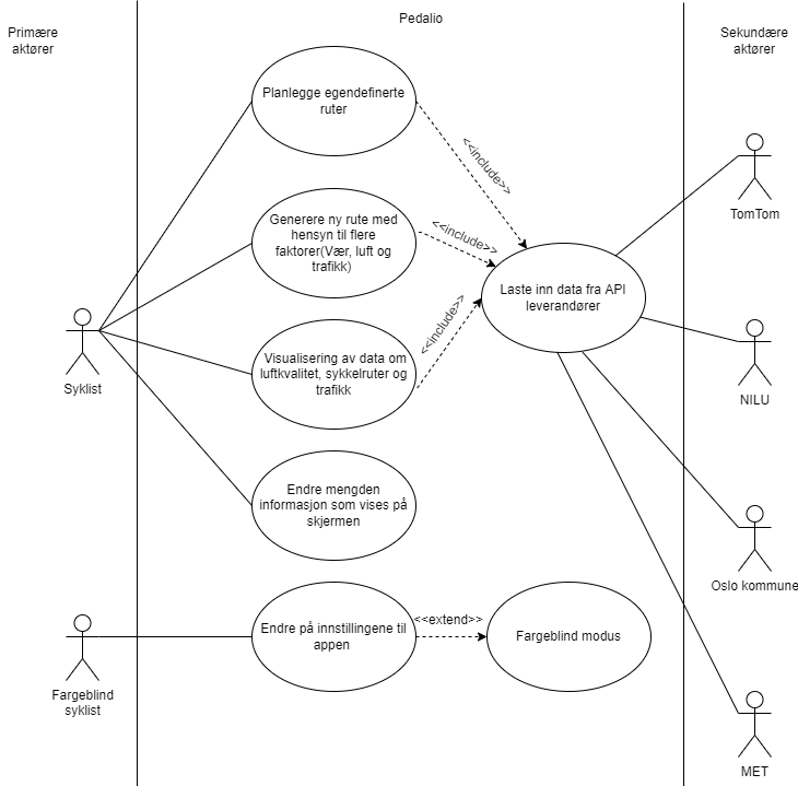

An interdisciplinary Project
As stated previously Pedalio was created as a group project by six students. Three of us were design students and the other three were programming and system architecture students. Because of the interdisciplinary nature of the project we early on decided to use a number of diagrams and focus on mutual learning in order for everyone to be on the same page. The digagram to the right is a visualization of the data structure of the project.
What could the app do?
The app was to have the base functions of a navigational app for cyclicsts. One could search using the TomTom API data to locate where one wanted to travel. Afterwards you could choose the destination, adding it to favorites if it was a location one often frequented, before being shown a path to the location. The app would show the bike lanes as dark blue lines on the map. We also made it so that when a location was chosen, you could pick to either take the route with the most bike lines or the shortest path to the destination.


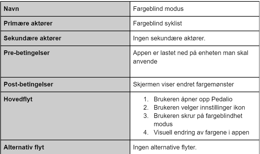
A focus on inclusion

We chose early on to focus on universal design and inclusion. We added key functions to aid the users we had included with respiratory issues or colorblindness. Through the selection menu a user could choose to visualize bike lanes, air pollution and weather. One could also choose to see the specific type of air pollution.
final user evaluations

The project was rounded off with evaluations of the application together with users. We chose to do this task based with thinking out loud and measuring metrics such as number of wrong clicks. Through this testing combined with final interviews we could determine both how happy they were with the final product and how intuitive the solution was.
